1. Home
  2. »
  3. Responsive Web Design Agency | Mobile Responsive Website…

Build the Website Your Users Deserve On Every Device

Welcome to Aarambh Webtech, your go-to responsive web design agency. We don’t just make websites—we craft fluid digital experiences that work seamlessly across desktop and mobile devices, tablets, and smartphones.

In today’s world where more than 60% of web traffic comes from mobile devices, your website needs to do more than just “function” on smaller screens—it needs to excel. That’s where our expertise in mobile web design steps in.

Responsive Web Design Agency
Responsive Web Design for All Devices

What is a Responsive Web Design Agency?

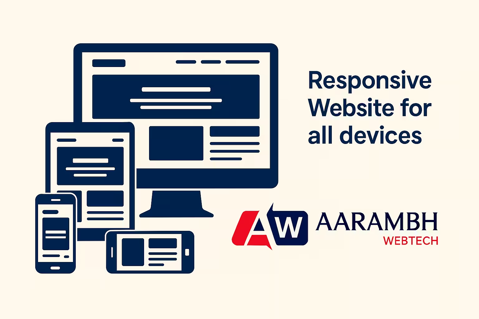
A responsive web design agency creates websites that change their layout, content, and interactive parts to fit different screen sizes. This adaptive design approach ensures that whether someone is browsing on a 6.7″ iPhone, a 9″ tablet, or a 27″ iMac, the experience remains consistent, easy to use, and very fast. This approach to web design ensures that your responsive web page looks great and functions perfectly on all devices.

At Aarambh Webtech, we use a combination of techniques to create responsive websites:

Responsive grid – Layouts grow or shrink in proportion, creating a responsive layout

Adaptive images – Pictures that fit screen and container size, alongside responsive images

CSS media queries – Style rules that shift with screen dimensions

Mobile-first approach – We start by designing for phones then scale up

The outcome? A single website. All devices. No compromises.

Why Responsive Website Design Needed for Your Business

Responsive design isn’t just a fad—it’s now crucial to survive in a competitive online world. Here’s why teaming up with a skilled responsive web design company like Aarambh Webtech is key:Lorem ipsum dolor sit amet, consectetur adipiscing elit. Ut elit tellus, luctus nec ullamcorper mattis, pulvinar dapibus leo.

Responsive website design isn’t just a fad—it’s now crucial to survive in a competitive online world. Here’s why teaming up with a skilled responsive web design company like Aarambh Webtech is key:

  • Mobile accounts for more than 58% of global web traffic, highlighting the importance of how mobile users interact with websites

  • Google uses mobile-first indexing, giving higher rankings to sites optimized for mobile

  • Since Mobilegeddon, mobile usability affects SEO

  • 53% of mobile users leave sites that take more than 3 seconds to load, emphasizing the importance of mobile performance

  • Bounce rates fall by up to 20% with responsive designs

  • Conversion rates improve by 67% on mobile-friendly websites

  • Eliminate the need for separate desktop and mobile versions

  • Reduce maintenance work

  • Enhance security with built-in SSL and safe payment systems

New gadgets will keep emerging—foldables, smart TVs, wearables. Your site needs to adapt immediately. Responsive web design ensures you’re prepared for emerging mobile technologies.

shape angle 2
shape line 5
shape line 6

Our Approach to Responsive Website Design

Aarambh Webtech offers comprehensive mobile web development services. We cater to different industries and business types, always keeping the mobile user experience at the forefront of our design process.

Our front-end development team utilizes cutting-edge techniques such as the viewport meta tag, css grid layout, and viewport units to create flexible layouts that adapt seamlessly to various screen sizes. We also implement responsive typography and responsive video elements to ensure a consistent look across all devices.

We follow a content-first approach, ensuring that your message is clear and impactful regardless of the device used to access your site. Our mobile-first approach focuses on creating a solid foundation for smaller screens, which we then enhance for larger displays through progressive enhancement.

Benefits of Our Responsive Website Design

  1. Increased Sales: A well-designed responsive website can boost sales by up to 200–400% through better user experience.

  2. Cost-Effective: One website. One team. One content strategy. Spend less, reduce confusion.

  3. Better SEO: With Google’s focus on mobile-first indexing, a responsive design gives your website a 30% higher chance to rank well.

  4. Enhanced Security: From SSL to secure payment options—we build with safety as a priority.

  5. Future-Proof: Our approach to responsive website design ensures your site is ready for whatever new devices may come.

Quality Assurance

We understand the importance of thorough testing in responsive website design. Our process includes:

    • Device testing across a wide range of smartphones, tablets, and desktops

    • Cross-browser testing to ensure compatibility with all major web browsers

    • Responsive testing to verify that layouts adapt correctly to different screen sizes

    • Implementation of graceful degradation techniques to maintain functionality on older devices

Let's Make Your Website Work Everywhere

Your website serves as your online storefront. We need to ensure it looks great and functions flawlessly on every device your customers use, from desktops to the latest smartphones. With the increasing smartphone usage trends, it’s crucial to prioritize responsive design.

📞 Get in touch with Aarambh Webtech today for a free consultation and start creating a website that boosts your brand, not your bounce rate. Let us help you harness the power of responsive website design to improve your mobile traffic and overall online presence.

Star.png